How To Design High-Converting Ecommerce Landing Pages That Rock (+ Examples)
Landing Page Emotions: Ecommerce brands often have mixed feelings about landing pages, feeling both excited for the potential benefits and apprehensive about the effort required.
Simplifying the Process: Creating a high-quality ecommerce landing page is more straightforward than it might initially appear, and it shouldn't be an overwhelming process.
Driving Traffic Effectively: Well-crafted landing pages are crucial for directing quality traffic into the sales funnel, making them a valuable part of any customer acquisition strategy.
Invest Wisely: Investing in a landing page can be seen as one of the most important steps in boosting ecommerce customer acquisition efforts.
Ecommerce brands may hear the words “landing page” and feel a combination of excitement and dread.
Excitement for all the possibilities it represents, dread for the effort it takes to make one that’s good enough to get results.
Don’t fear, we’ll get through this together. Building out a high-quality and well-performing ecommerce landing page doesn’t need to be as complicated as your imagination makes it out to be.
Plus, there’s no better way to drive good traffic through the funnel.
A landing page might be the most important investment in your customer acquisition strategy. After all, the priority weighs heavily when you consider it’s what may be many customers’ first-ever introduction to your brand.
Make it count!
In this article, I’ll explain what an ecommerce landing page is, why they matter, and best practices for landing page optimization, and we’ll show off some of our favorite ecommerce landing page examples.
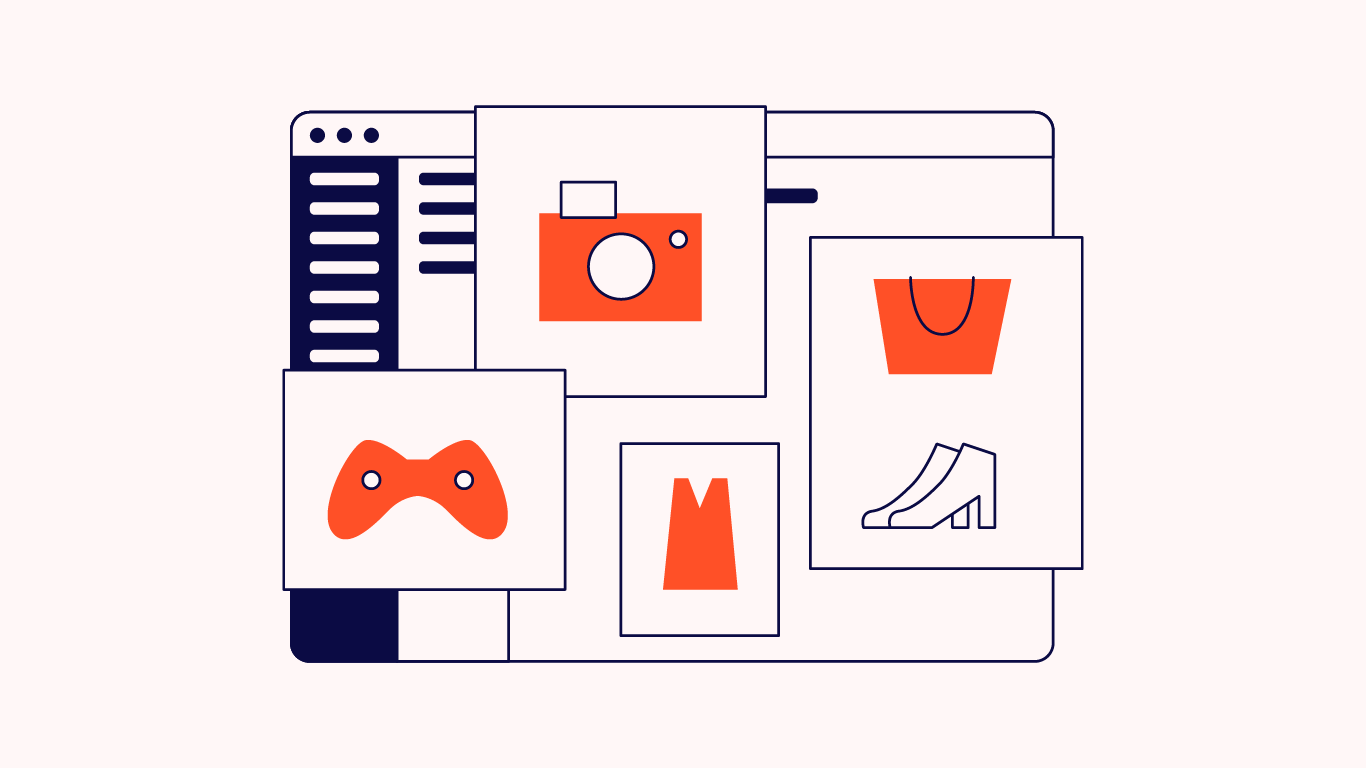
What is an Ecommerce Landing Page?

An ecommerce landing page is a web page designed specifically to capture potential customers from a certain source (social media, paid ads, email, influencer marketing, etc.) and drive them to take a specific action (email sign-up, conversion, product pre-order, whatever) with your brand.
It’s your online store’s precision tool amongst blunter instruments—homepage, product pages, collection pages, etc.
Generally, shoppers can only find these landing pages via the channel they were built to target and don’t get a navigation link from your homepage.
This is by design, so you are only getting the traffic you designed it for, thus increasing chances of conversion from visitors.
That said, your landing pages will have a similar design as your main site pages, just with fewer chances to navigate elsewhere, beyond your singular call-to-action (CTA).
Your landing page should have simplified CTAs or messaging featured at the top to accomplish that one specific goal.
Visuals can help out here, so keep reading to check out some examples of different types of landing page designs.
Landing page vs homepage

I compared landing pages to precision tools earlier. It’s true—they target very specific types of potential customers with very specific messaging to drive one specific action.
Compare this with a homepage, whose target is anyone who might want to buy your products. A useful tool, but blunt all the same.
Or to use a different analogy, your homepage is Grand Central Station, delivering the largest number of people to many different trains. Your landing page is a chartered bus that only picks up at one location and only drives passengers to the same place each time.
Let’s compare various aspects of these pages before we move on:
| Homepage | Landing Page | |
| Purpose | Introduce the brand and its products in a broad sense, engage visitors to explore more. | Prompt a specific action related to a targeted marketing goal. |
| Target Audience | General public, anyone visiting the website. | Specific segment of the audience targeted by marketing campaigns. |
| Content Type | Diverse, including information about the brand, various products, and more. | Focused content on a single product or offer to drive conversions. |
| Calls to Action | Multiple, no single focus. | Singular, focused call to action to increase conversion rates. |
| Navigation | Comprehensive, often with a menu to access various parts of the website. | Minimal or none, to avoid distractions and focus on conversion. |
| Visual Design | Reflects overall brand, diverse elements to engage users. | Streamlined and targeted to the offer, minimalistic to focus attention. |
| Traffic Sources | Organic search, referrals, general brand awareness. | Targeted paid ads, specific marketing campaigns. |
Landing page vs product page
Product pages, or PDPs (product description pages, as some call them), are as simple as their name. PDPs are built to describe and sell a certain product on your online storefront.
They’ll often include the most thorough product attributes for a specific product a visitor can find, like specs, pricing, size guides, reviews, and anything else important to know when making a purchase.
A PDP might even include related products or links to different product categories. They are general in their messaging since a user has already proven qualified by clicking on the PDP.
Conversely, a landing page is crafted with a marketing purpose other than just an order.
A landing page is built to drive one action: Collecting email addresses or other customer data, converting using a discount or promotion, driving giveaway entries, or filtering leads around a focused marketing campaign.
You can even build a landing page for SEO purposes.
A well-built landing page will include limited calls to action (CTAs) to focus click-through only on the places your brand wants the visitor’s attention.
Here’s a rundown of the central differences between these pages:
| Product Page | Landing Page | |
| Purpose | Describe and sell a specific product. Offers comprehensive details like specs, pricing, size guides, and reviews. | Drive a specific marketing action like sales through promotions, collecting emails, etc. |
| Content Focus | Product-focused, providing thorough attributes and information for informed purchasing decisions. | Campaign-focused, tailored to promote a product or service to drive conversions. |
| Calls to Action | May have multiple CTAs such as "Add to Cart", "Wishlist", and sometimes cross-sell or upsell other products. | Limited CTAs to focus user actions towards conversion, typically one main CTA. |
| Navigation | Usually accessible through website navigation, part of the general browsing experience. | Often standalone, not directly navigable from the main website unless through specific campaigns. |
| Audience | General shoppers who have shown interest by navigating to the PDP. | Targeted audience, often reached through specific marketing channels like paid ads or emails. |
| Design | Detailed, aiming to provide as much information about the product as possible. | Streamlined and persuasive, designed to minimize distractions and maximize conversion rates. |
| Traffic Sources | Organic search, direct website navigation, potentially from search ads or general digital marketing. | Highly targeted traffic from specific marketing campaigns (e.g., social media ads, email blasts). |
| Measurement | Success measured by product interest and conversion rates within the standard browsing experience. | Success tightly linked to campaign goals, tracking conversions from specific CTAs. |
| Example | Detailed page with pricing, specs, reviews for informed purchasing. | Page promoting a product with a strong CTA like "Buy Now" to capture sales from a marketing push. |
Why You Need to Build Ecommerce Landing Pages
Regardless of the category, from skincare to sporting goods, your ecommerce brand needs to include landing pages as part of your overall ecommerce marketing strategy.
A landing page is one of the most effective ways to capture new leads, filter traffic to a certain page, and, ideally, reach your conversion goal and drive those sales metrics.
It’ll ensure the brand messaging that captures an initial click stays consistent once the first-time customer clicks through.
With a focus, you’ll see a better return on investment (ROI) for each campaign.
The best ecommerce landing pages will also be optimized for the person clicking on your content based on where they came from and even why they clicked.
While they navigate to other places on your ecommerce store, the initial referral source will always be tagged with that landing page tag, and you can track the behaviors throughout the whole experience.
You’ll then gain insights into what this target audience is into and what gets them to add to the shopping cart and checkout.
Love A/B testing? Just another reason to add landing pages to your marketing mix.
You can easily try out different types of messaging, CTAs, product images, variations in limited-time offers, or segmentation without making changes to your entire website.
The highest converting option will shine right away. And it doesn’t take long to iterate on a page once you build a template.
Benefits of ecommerce landing pages
So, obviously, you should leverage landing pages for your ecommerce store, but just to put an even finer point on it, let’s list out some of the benefits for easy reading.
- Higher conversion rates. Given the more targeted audience and more specific messaging, landing pages are much better at converting than any other type of page.
- Better ROI for paid ad campaigns. When paid ads point to dedicated landing pages, they just convert better and your ad spend goes further (better ROI = more cash back to spend).
- Highly targeted messaging. Instead of trying to market to everyone at the same time, you can message to specific pain points experienced by individual audience segments.
- Perfect for A/B testing. Landing pages are excellent candidates for A/B testing, enabling you to test particular elements (headlines, CTAs, visuals, etc.) and iterate based on the results.
- Better user experiences (UX). Since landing pages limit distractions and use singular CTAs, the on-page experience is focused and allows for easier decision making.
- Faster to launch. With powerful landing page builder tools, brands can quickly create landing pages via drag and drop editors and duplicate their best versions for future campaigns without rebuilding from scratch.
4 Types of Ecommerce Landing Pages You Should Build
When it comes to landing pages, there are a few ways to do it. What are the types of landing pages to know?
1. Top-of-funnel landing pages
Top-of-funnel landing pages will capture new visitor traffic.
They should have the basics of your brand, like your brand story and why it came to be, what pain points your products solve, credibility through social proof like brand reviews and press hits, FAQs, high-quality images, and your core values.
You can use this landing page for lookalike campaigns with audience segments similar to your current customer who may not have heard about you.
The conversion rates for top-of-funnel landing pages are low, so the CTA should be focused on getting their email address to send them further down the marketing lifecycle.
Types of landing pages that could be considered top-of-funnel pages:
- Sales landing pages. This type of landing page is designed to create buzz for a new product or special offer with broader targeting to introduce shoppers to your brand.
- Campaign landing pages. Another top-of-funnel landing page, this is specific to a particular marketing campaign targeting a large audience for brand awareness.
Traffic sources for top-of-funnel landing pages:
- Social media campaigns
- Content marketing
- SEO (search engine optimization)
- Influencer partnerships
2. Mid-funnel landing pages
These pages will get traffic from qualified leads who haven’t yet pulled the trigger on a purchase on your ecommerce website.
The content here will be focused on getting that conversion.
You can use messaging like you would for abandoned carts with a sense of urgency (examples include “Still thinking about it?”, “This offer expires tomorrow!”, or even include a discount code in a pop-up), and more social proof.
The CTAs on this page should make checking out a breeze, and they can be as simple as “Buy now!”
Product landing pages would fall under this category, encouraging already interested shoppers to read more about the features and benefits for a product or collection to push them closer to purchase.
Sales landing pages would also fit nicely here, with a focus on shoppers already aware of your brand.
Traffic sources for mid-funnel landing pages:
- Retargeting ads
- Email campaigns
- Word-of-mouth links
3. Bottom-of-funnel landing pages
Bottom-of-funnel landing pages are for users who are even closer to buying than mid-funnel but are still non-purchasers.
Maybe they’ve left a full cart or browsed actively but bounced before completing the sale.
You can retarget users here after they spend time on your site. Your biggest goal here is not only to sell, but to upsell.
Dangle high-value bundled offers, related products for cross-selling opportunities, and something to sweeten the deal, like a discount code and free shipping on their order if they complete it today.
PPC landing pages are what you might want to use at this stage of consideration, since you have more customer data and can specifically target a high-intent segment with specific messaging.
Traffic sources for bottom-of-funnel landing pages:
- PPC (pay per click) advertising
- Email segmentation
- Retargeting campaigns
4. Repeat purchase landing pages
Last but not least: Repeat purchase landing pages. The name of the game here is retention and re-engagement.
You’ll build this one out with repeat purchasers and returning customers in mind.
Brand copy, CTAs, and potential offers should support increasing LTV (lifetime value) and retention rates through loyalty incentives, access to new products or variations, content or products related to their previous purchases, and opportunities to earn future incentives through customer referrals.
This landing page is less focused on sales and more on nurturing an established relationship.
Testimonial landing pages, while perfect across all parts of the funnel, are really good for targeting repeat customers. Using testimonials for long-time happy customers, you can assure these future loyal customers that they are making a great choice.
Traffic sources for repeat purchase landing pages:
- Email marketing
- Loyalty program notifications
- Word-of-mouth links
Ecommerce Landing Page Best Practices For The Best Marketing ROI
Knowing what we know now about ecommerce landing pages, you might be able to go out and start creating lovely and fairly effective pages. They’d be good enough.
But, good enough is not good enough for your brand.
You need to create stunning and truly high-converting landing pages. You need to see how high you can get a conversion rate. So, here are some best practices you should follow to make it happen.
Craft highly targeted messaging
Cast off the generic messaging of homepage copywriting in favor of hyper-focused language for individualized customer segments.
With insights based on the visitor’s source and other targeting elements, you can speak more directly to these customers, highlighting their particular pain points and needs.
Plus, you can use a clear call-to-action that stirs your audience to act.
This type of messaging is much more effective for converting visitors, plus it’s a lot more satisfying for marketers to create.
Integrate strategic social proof for greater effect
You’ve certainly got social proof and user-generated content (UGC) to deploy across your marketing campaigns, but you have to be specific when adding these testimonials to your landing pages.
Again, you are speaking to a specific audience, so curate your social proof accordingly.
Find quotes that address particular concerns, like cost savings, reliability, functionality, or customer support. Being able to battle objections with other customers makes your argument stronger.
Design mobile-first experiences

One day, everyone will be shopping from their phones. And that day is coming quickly.
Statista projects that by 2028, mobile commerce will make up 63% of all ecommerce sales. The point is, we aren’t living in a desktop shopping world any longer.
That’s why Google uses your mobile site to index, called mobile-first indexing. They consider your mobile site the main version of your site.
So, you should follow suit and use mobile-first design to create your landing pages.
If that version of your landing page is awesome, your visitors will get a smooth experience and will be more likely to move on to convert.
Develop clear visual hierarchy across the page
Your landing page should be clear and easy to read.
Designing each page with a visual hierarchy that draws shoppers’ eyes toward the key elements means they will be more likely to keep scrolling.
A minimalistic design reduces visitors’ cognitive load, enabling easier decision-making (so they might actually buy your stuff).
On top of that, a straightforward headline in your hero section, scannable subheadings as you scroll, and bulleted feature and unique selling prop breakdowns contribute to a simple design.
Deliver personalized experiences
Depending on your data tracking capabilities and level of segmentation, you can also deliver personalized customer experiences dynamically on your landing pages.
This personalization can reflect things like their shopping behavior on-site, their general interests, or their demographic details.
More personalization can make your already targeted messaging even more targeted and more likely to drive conversions.
Leverage technology for approximate in-store shopping
The in-store shopping experience is hard to compete with, but technology is getting better every day.
While you can’t feel the texture or weight of a product in your hands while online shopping, you can get a better view of it with things like 360 degree views, slider product images, and augmented reality (AR).
Where taking a full 360 degree image used to require special equipment, it can now be done with your mobile phone.
Adding this interactive product imagery to your product-focused landing pages gives customers something to engage with, giving a clearer sense of what they might buy.
Augmented reality can be integrated into mobile experiences, too, so that potential customers can see your stuff in their own homes.
Use urgency and scarcity, but sparingly

If you constantly use urgency or scarcity marketing, your customers may stop believing you. Talk about the brand who cried limited-time offer.
But, used wisely, these tactics can drive action. A wellplaced countdown timer never hurt nobody.
An easy example is your special offer landing pages, where urgency and scarcity may be real concerns for shoppers.
If, for instance, you are launching a limited run of a product, both scarcity and urgency are factors in shopping decisions.
Analyze, optimize, and iterate for success
Finally, you need good data to learn from your successes and mistakes. This is key for great landing page optimization.
With the right tracking tags, heatmaps, A/B tests, and metrics, you can paint a clear picture of how each landing page campaign went off, good or bad.
You don’t need every landing page to be the best. A few stinkers can give you valuable insights into what not to do.
Great landing page builders have these sorts of metrics built-in (and even A/B testing), so you can run multiple campaigns, learn great lessons, and launch optimized versions of the best performing pages for future campaigns.
Find landing page templates that work well and iterate on them consistently to grow conversions.
4 of the Best Ecommerce Landing Page Examples
The best landing pages are concise, free of clutter, have clear CTA buttons, pare down your main website experience to focus on the essentials, including social proof, and are highly visual while being mobile-friendly.
Let’s take a look at some of our favorites:
1. Thistle
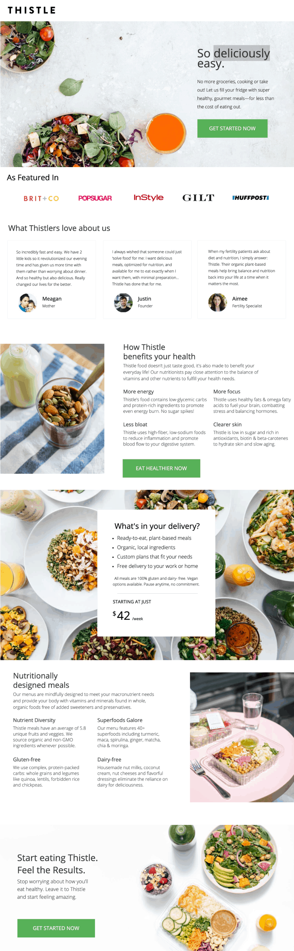
This mobile-optimized page from Thistle shows off a clean, responsive design highlighting the brand’s value proposition with a clear focus on the health-minded customer.
The use of white space breaks up the blocks of text to still focus on readability.
2. Infinite Moon (Everpillow)
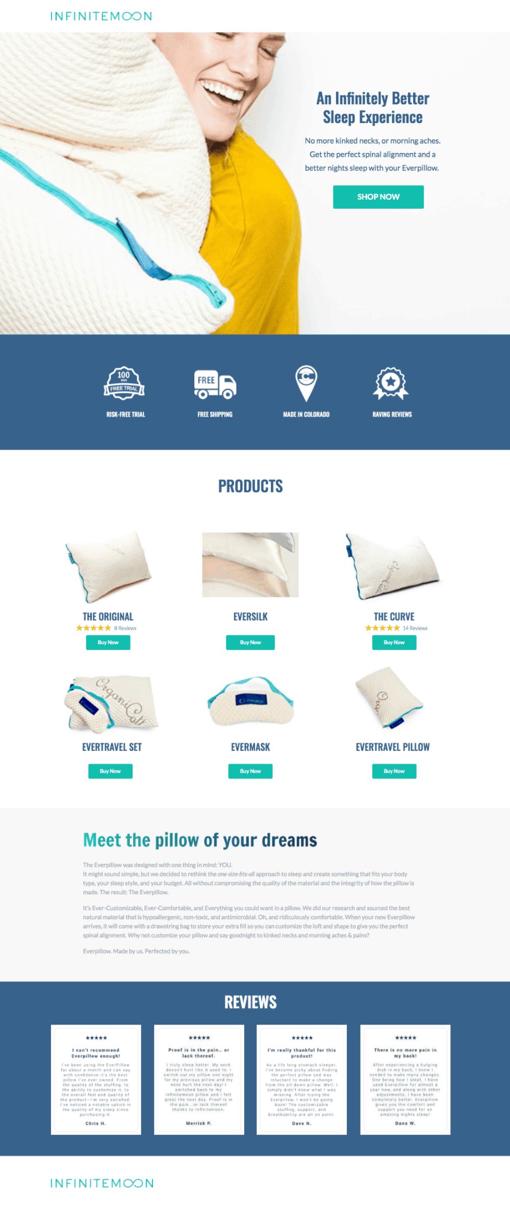
Infinite Moon fits a lot of copy on one landing page while also including strong customer testimonials.
The “Shop Now” CTA above the fold on the top of the page is hard to miss, and if a qualified customer keeps scrolling, they’ll see the brand values visualized above a product breakdown, then a handful of 5-star customer reviews at the bottom of the page.
3. Coffee Curators (formerly The Coffee Network)

This thorough landing page from Coffee Curators utilizes a few highly visual tactics: infographics, step-by-step instructions with product images, and even a short video for the customers qualified enough to reach the bottom.
4. Olipop


Olipop really nails the assignment with this landing page targeting guilty soda lovers.
With an already targeted product—soda without all the bad stuff—their CTA can be very general following their direct plea of “Ditch The Zero, Switch to Olipop”. A simple “Shop Now” does the trick at that point.

Comparing themselves to the big brands’ zero sugar sodas, you can see it’s not only not bad for you, but maybe kinda good for you?
Seeing real-world examples can help take best practices to the next level. We love the galleries and case studies from Unbounce, Shogun, and Hubspot for further inspiration.
Build Better Landing Pages, Get Better Results
Ready to get rolling on building out your own product-focused landing page?
You can start with landing page builders on Leadpages, Unbounce, or Canva.
For our Shopify friends, check out the vast selection of landing page builders in the Shopify App Store, like Shogun or PageFly.
Want some more tips for your growing ecommerce business?
Look no further: Here’s some direction on measuring the success of your website and tips for tracking KPIs once the customer moves down the sales funnel after that first landing page visit.
Do you have some of your own best practices for landing pages? Share them with us on LinkedIn!
Don’t miss another opportunity to optimize your ecommerce brand and subscribe to The Ecomm Manager newsletter here.