The Low Impact Manifesto: Organic Basics’ 10 Guidelines For Building Greener Websites
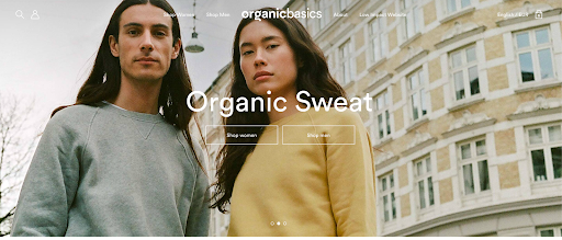
Organic Basics has been in the business of producing and selling sustainable clothes online since 2014. We’re constantly trying to figure out how to be even better at sustainability, and last year this led us to build a low-impact version of our online store.
The low-impact version of our website reduces carbon emissions up to 70% by using some of the techniques outlined below. More importantly, the site tells the story of how sustainability doesn’t just matter for the products you sell, but also how you sell them.
We had been reading more and more about sustainable websites all over the internet. Low Tech Magazine's solar website and Wholegrain Digital’s Website Carbon Calculator had been appearing as inspiration in various Slack channels, so we decided to start experimenting ourselves.
Simple rules with endless possibilities
First, we read up on how to actually build a sustainable website and were inundated with tips and tricks. We soon realized that we couldn’t do everything and needed to narrow down the options.
Inspired by the Dogme 95 manifesto and its Vows of Chastity, we wrote a manifesto containing 10 rules for building a low-impact website. Like the Vows of Chastity, they tow the line between being hyper-specific and open to interpretation.
This allows designers and developers the space to find the solutions that work best for their technical setup, without compromising on sustainability. The rules don’t specify the use of any specific technologies, and so these can grow alongside technological development.
I’ll go through the 10 rules below, and provide some ideas on how you can implement them on your own site.
1. Do not load any images before they are actively requested by the user
Images are a big contributor to the data usage of any website, and this especially applies to ecommerce stores. We need to show our products visually, and often from multiple angles or on different models.
What’s important here is that we only load the images that users actually need to see. This can mean only loading images as a user scrolls down a page, as they click through a slideshow, or even hiding them until a user clicks “show image”.
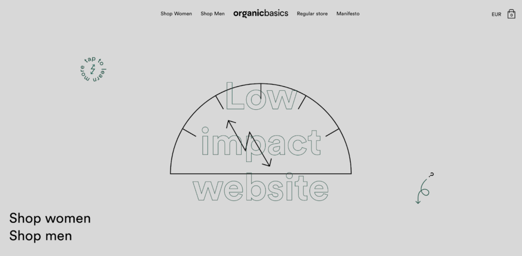
This rule is a bit tricky because illustrations in the form of scalable vector graphics (SVGs) are still allowed, but the size of an SVG is incredibly small compared to most images. We’ve utilized this on our site by showing illustrations on our collection grid (see below), and only showing images on the product page when a user actively decides to load a slideshow.


2. Minimize the power consumption on the user’s device
This one can be difficult to measure but is nonetheless important. The primary reason for including it is to make sure the focus is not solely on what happens in the transfer of files, but also about what those files do once they reach the user’s device.
Currently, the two primary things that we focus on here is the use of animations and the amount of scripts actively running on your website. Any use of 3D can also really mess with a device’s battery.
Some of the questions you can ask yourself to help work with this rule are:
- Does this animation / 3D / script add to the user experience, or is it just filler?
- Can we limit the amount that we use this animation / 3D / script on the site?
- Can we simplify this animation / 3D / script, so it only does exactly what it needs to?
Related Read: Making More Responsible User Experience Design Decisions
3. Adapt to reflect the amount of renewable energy your site is running on
With the way energy grids and the internet currently work, no website can run 100% on renewable energy. Even Google, which is increasingly focusing on renewable energy to operate its data centers, doesn’t achieve that.
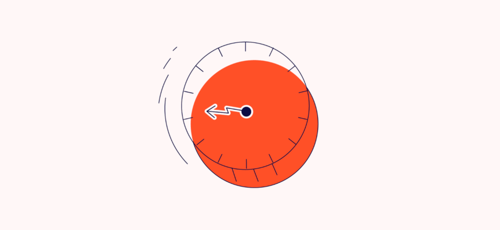
What we can do instead is to make our websites adapt to the amount of renewables in the electricity grid. A lot of energy companies, like Barry, do something similar already by providing their customers with an app that shows when the electricity is less carbon-intensive (see below).

On the Organic Basics low-impact website, we rely on the carbonintensity.org.uk API to provide us with data. The API enables free and easy access to the carbon intensity of various regions in the UK. An alternative would be the Electricity Map API, which is quite expensive but has data from many more regions across the world. The downside of their API is the price of admission.
We had to choose the London data center since our site is hosted on Google Cloud and it’s the only option in the UK. Ironically, this data center is located in one of the more carbon-intensive regions in Google’s cloud hosting offering.
Depending on the carbon intensity, we change the quality of images being served as well as restrict the number of animations. If the electricity is really carbon-intensive, we even shut down the website entirely.
Instead, we show a bare-bones page that lets our customers know that the site is inaccessible. It even gives an approximation of when they can access the site again, based on forecasting data from the carbonintensity.org.uk API. Since we launched the site, it’s been unavailable for approximately 12.5 hours.
4. Inform the user of the impact of their browsing behavior
When I’m shopping online, I expect to be able to see how much my cart contents cost. This allows me to figure out whether I still have money to spend or whether I need to go hunting for some discounts. Similarly, we should inform our customers of the impact their browsing behavior has on the climate.
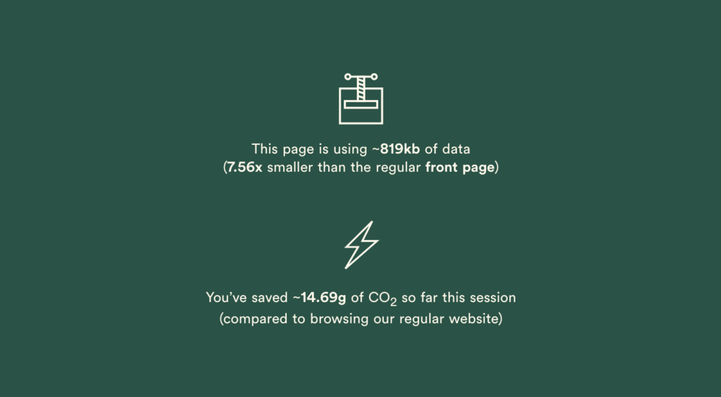
On our website, we continuously calculate the emissions that a user accumulates as they browse around. This way, they can be familiarized with what carbon emissions are and how they relate to website usage. If possible, you should also track these emissions yourself, because it’s ultimately the responsibility of the website owner to reduce them.
5. Do not make use of videos
We love videos at Organic Basics, but they can really mess up a website’s carbon budget. This rule is by far the strictest out of the 10, but there’s a very good reason.
The internet has become more and more dominated by video, and instead of following the trend, we decided to go against it. To truly combat the climate crisis, we don’t just need to optimize and minimize; we need degrowth.
With this rule, we force you to think outside the video player and consider how to add motion and dynamics without relying on loading MBs upon MBs of video content. As an alternative, consider using CSS or SVG animations. Oh, and that goes double for GIFs. Don’t. Use. GIFs.
6. Store data locally on the user’s device to minimize data transfer
All content you show on your website can potentially be saved locally on the user’s device. There’s no point in downloading something twice if it’s unlikely to change.
Most developers will already recognize this rule as important. It will optimize your website’s performance while simultaneously reducing its environmental impact.
To achieve this, you can consider looking into building your website as a Progressive Web App and allowing for offline access.
7. Compress all data to the greatest extent possible
Once your files reach the user’s device, you should make sure they stay there until they get updated. That’s called caching. But, before they even get there, you need to make sure that those files are as small as possible.
Minify your CSS and JavaScript and compress your images. A lot of modern frameworks, like Nuxt.js or Next.js, will do this work for you for a lot of file types.
This is really a no-brainer and, like caching, makes sense from a performance perspective as well.
8. Load only the most crucial programming scripts, frameworks and cookies
Every time you add a library or an external script to your code, you increase the size of the page. Even if the library is only 1kb large, this will quickly turn into 1MB if 1000 users load the page.
This rule is here to remind you to consider every single script, framework, and cookie you add. The word “crucial” is what you should focus on here. Conversion tracking and analytics are crucial on all ecommerce stores, but is it really necessary on every page?
These considerations go great with a little privacy consideration since GDPR and similar regulations require consent before loading scripts.
9. Limit the amount of light emitted by the screen
Since announcing the manifesto, we’ve received comments suggesting that this rule doesn’t actually make a difference because using dark mode only reduces energy usage on OLED screens.
Well, we say: that’s good for users with OLED screens! On the Organic Basics low-impact website, we still use some white colors here and there because it’s an important part of our brand experience. However, as shown by the below example, we also introduce a yellow tint, as well as a grey nuance, to limit the amount of light emitted by the screen.

10. Optimize and limit the use of custom fonts
Finally, we come to the use of custom fonts. Fonts don’t really account for much in the larger scheme of website-related emissions, but it can easily get out of hand.
For this reason, we stuck to just one single custom font on the low-impact website. We also went as far as removing certain characters from the character set. There’s really no need for cyrillic on an English-language page.
The next step
If you follow these 10 rules, you are definitely well on your way towards transforming your ecommerce site into a low-impact version. More importantly, you’ve gone through the journey of seeing your website from a sustainability perspective and as an important piece in the sustainability puzzle.
When considering these rules, it’s important that you find what works best for your brand. Not all rules are equally strict, and you should use this to your advantage. Your low-impact website is not the same as mine, nor should it be.
A sustainable internet, however, doesn’t just stop with electricity and energy efficiency, which is the focus of these 10 rules. If we open up the perspective, we need to also start considering the materials that our devices, data centers, and networks are made of.
The internet is built on (hilarious) cat memes and blogs, but it’s also built with very real rare earth minerals that are often mined by people in poor working conditions at great environmental expense.
Within the last couple of years, Fairphone has given us a more sustainable smartphone, but the conversation has not at all started about the internet as a whole. In other words, we need a Fairphone for server infrastructure.
Related Read: Challenging And Motivating Your Team To Make The Planet A Stakeholder Of Your Site
More on all things sustainable: The Sustainable Ecommerce Handbook